

Case Study 02
Auckland University Student Portal
Transforming the University of Auckland Student Portal into a Seamless, Mobile-First Experience for Academic Success and Campus Life

Introduction
The University of Auckland’s existing student portal provides essential academic and campus information, but its mobile experience is often cumbersome and unintuitive. This project aimed to reimagine that experience through a dedicated mobile application, designed to put critical information and tools directly into students’ hands. By streamlining access to academic records, campus services, and real-time updates, the app empowers students to navigate university life with ease, efficiency, and confidence.
Client
University of Auckland
Type
Mobile App, UI/UX Design, Student Experience, University Portal
Industry
Education
Role
Lead UX Designer, UI Designer, UX Researcher, Prototyping, Usability Testing
Technologies

Problem Statement
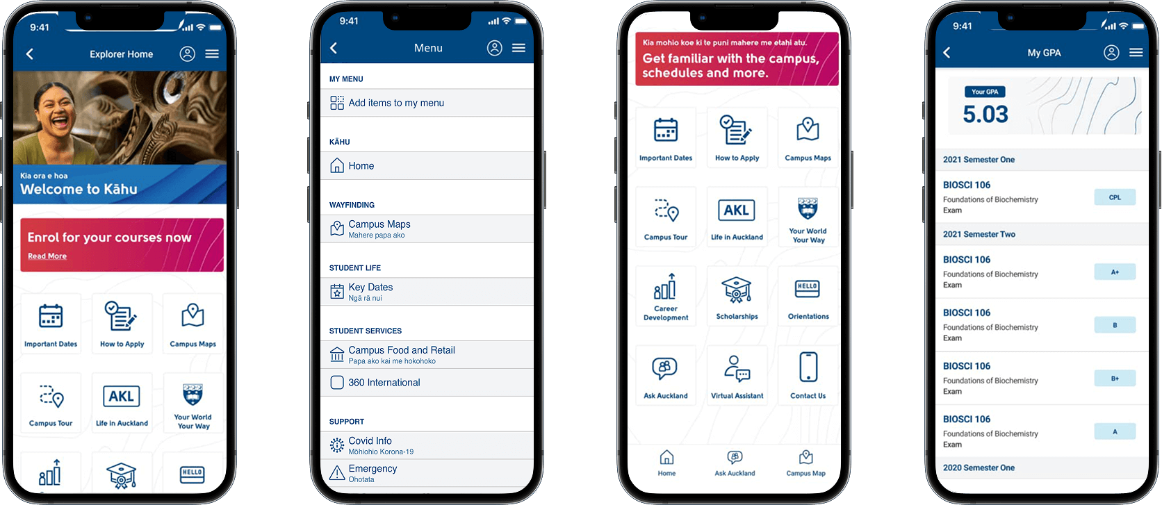
The existing University of Auckland student portal is functional—but far from intuitive, especially on mobile devices. Students often face a poor mobile experience, struggling with complex navigation that makes accessing academic records, schedules, and campus information time-consuming. The lack of timely notifications leaves them unaware of important updates, while inconsistent layouts and ineffective use of color and visual hierarchy contribute to a fragmented and confusing user experience. Together, these challenges create friction in everyday tasks, highlighting the need for a more streamlined, mobile-first solution that prioritizes usability, clarity, and student satisfaction.
Key Challenges
Poor Mobile Experience
The current portal is not optimized for mobile use, making navigation clunky and frustrating on smartphones.
Complex Navigation
Students struggle to locate essential services like timetables, grades, or campus announcements quickly.
Fragmented User Experience
Accessing different services feels disjointed—like using several disconnected tools instead of one cohesive app.
Time-Consuming Access
Completing simple tasks (e.g., checking exam schedules or updating course enrollment) takes several steps and lacks efficiency.
Key Design Objectives
Enhance Mobile Usability
Design a responsive and intuitive mobile interface that allows students to complete key tasks quickly and easily.
Simplify Navigation
Restructure the information architecture to reduce friction and make essential features easily accessible.
Improve Interaction Feedback
Introduce meaningful micro interactions to give users visual and tactile confirmation during actions.
Focus on Student-Centered Design
Focus on Student-Centered Design
User Research
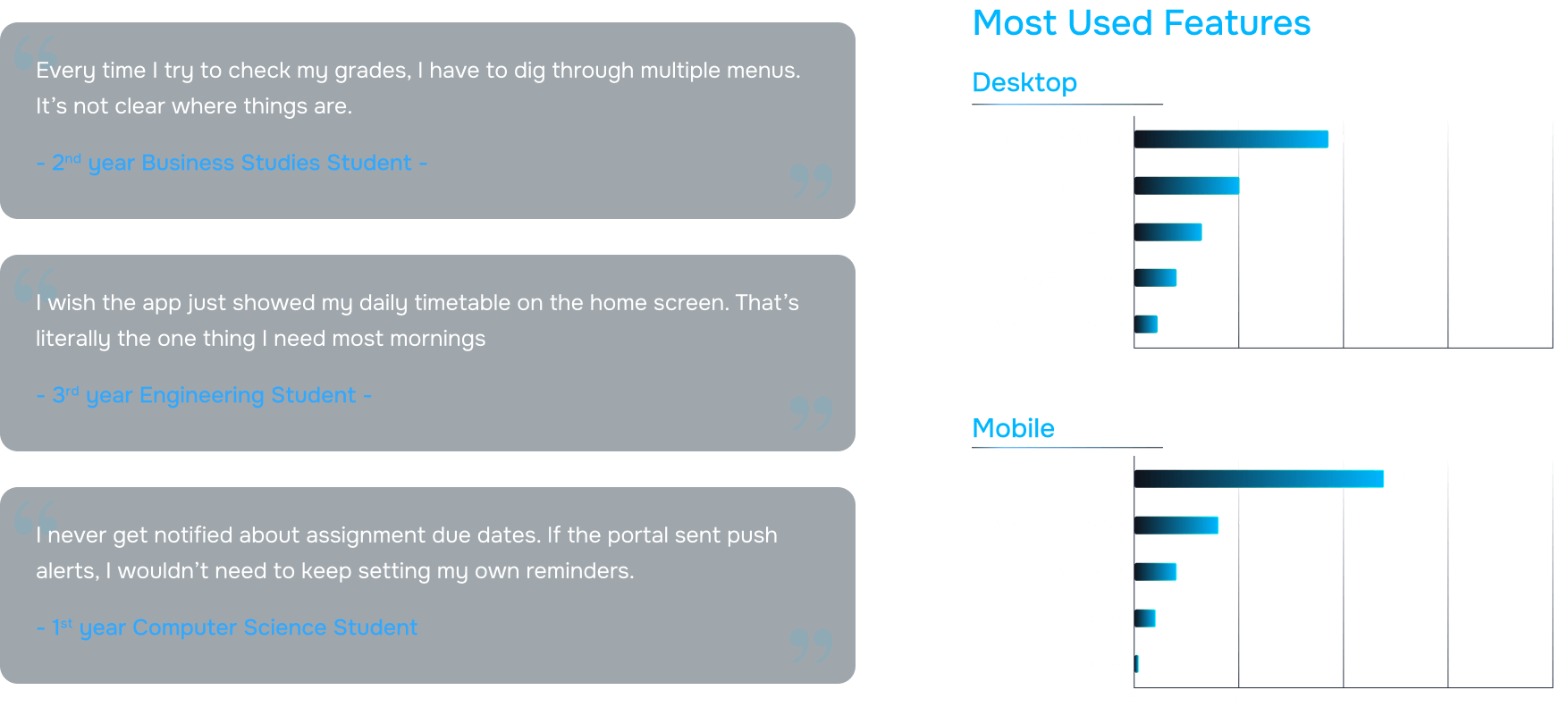
To understand the pain points and needs of students using the University of Auckland portal, I conducted a comprehensive UX research phase. This included 10 in-depth user interviews to capture personal experiences, frustrations, and expectations, as well as over 60 survey responses to gather broader quantitative insights into usage patterns, preferences, and common obstacles. Additionally, 5 contextual inquiries were conducted, observing students interact with the portal in real-world settings to identify hidden pain points and workflow inefficiencies. Through this mixed-method approach, I was able to uncover recurring challenges, such as navigation difficulties, delayed access to academic information, and lack of proactive notifications, which informed the design strategy for a more intuitive, mobile-first student experience.
78
%of students primarily access the student portal on mobile devices, but rate the experience as unsatisfactory or confusing.
65
%of surveyed students said they struggle to complete basic tasks like checking grades or timetables without unnecessary steps.
87
%ranked academic tools (grades, timetables, course materials) as the most critical features they use regularly.
71
%expressed a strong need for real-time notifications for deadlines, announcements, and timetable changes.
60
%of users reported difficulty identifying key actions due to poor color contrast and inconsistent visual hierarchy.
2.3
/5User Satisfaction Rating
User Personas
To ensure the mobile app addressed the needs of a diverse student body, I developed three key personas based on research insights: Teresa Howard, a Computer Science student; Clara Santos, studying Business; and Alex Matthews, an Engineering student. These personas were selected to represent a cross-section of academic disciplines, study habits, and campus engagement. Teresa seeks quick access to her course schedules and project deadlines but struggles with navigating complex interfaces. Clara values streamlined access to administrative tasks and campus updates but often misses important notifications. Alex frequently checks academic records and event schedules but finds mobile interactions time-consuming and fragmented. By combining findings from user interviews, surveys, and contextual inquiries, I identified their primary goals, pain points, and behaviors, which guided the design of intuitive user flows, simplified navigation, and proactive features like notifications, ensuring the app effectively met the needs of different types of students.

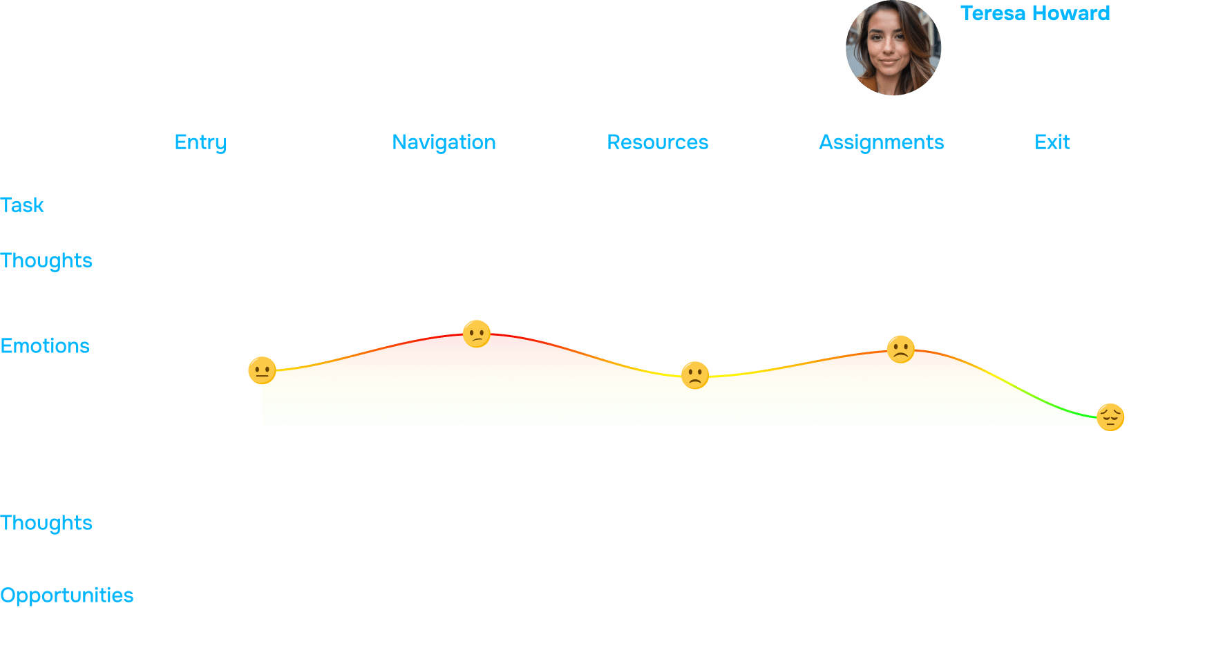
User Journey Map
To visualize and better understand student interactions with the University of Auckland portal, I created a User Journey Map based on the personas—Teresa Howard, Clara Santos, and Alex Matthews. This map illustrated key touchpoints, actions, emotions, and pain points throughout their daily interactions with the portal, highlighting moments of frustration, confusion, and delays. By synthesizing insights from user interviews, surveys, and contextual inquiries, I was able to identify critical pain points such as complex navigation, slow access to information, and lack of timely notifications. The journey map allowed the team to empathize with students’ experiences, prioritize design improvements, and define clear opportunities for enhancing usability, streamlining workflows, and introducing proactive features that address real student needs.
Design Screens
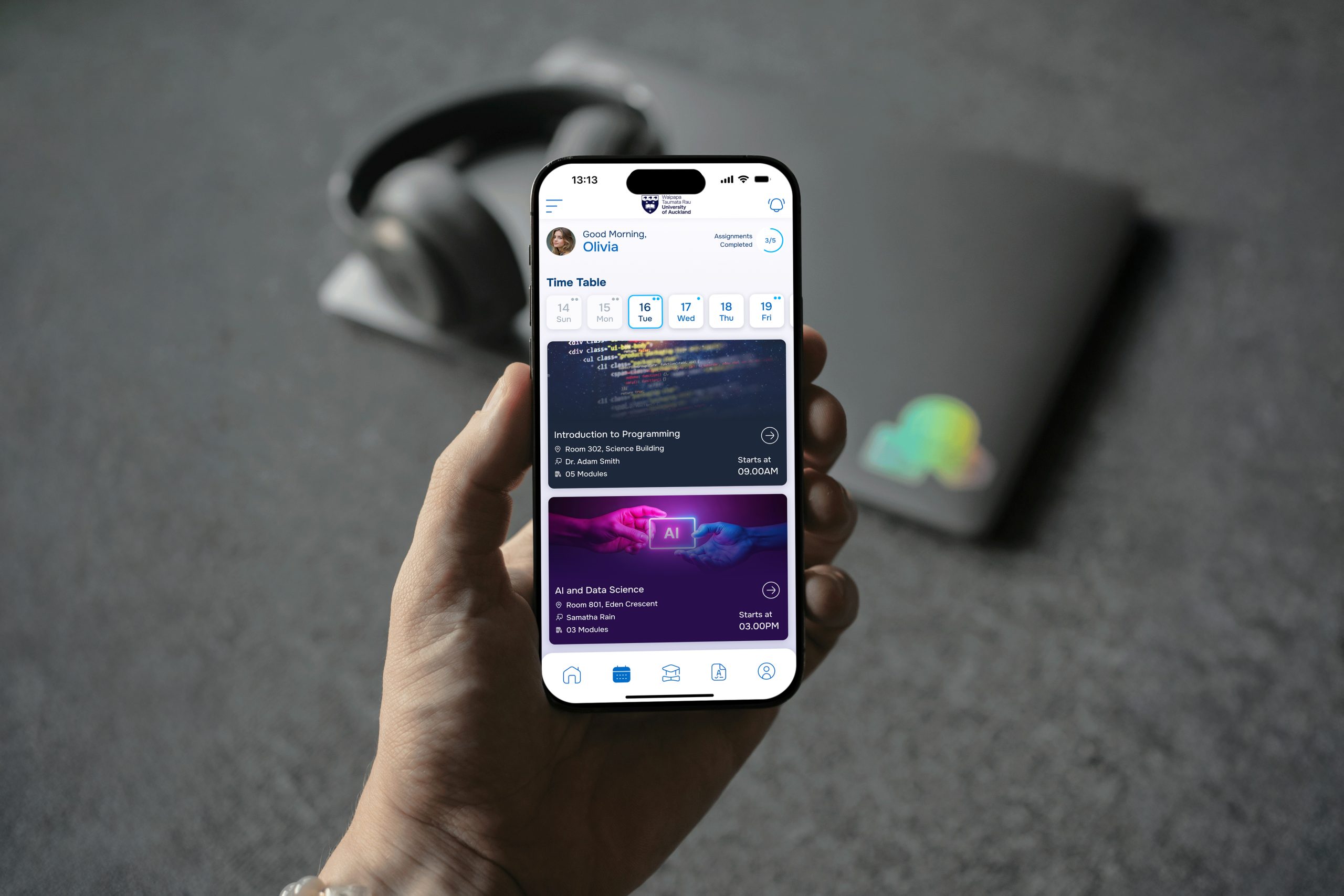
To create a seamless and intuitive mobile experience, I established a clear design architecture that prioritized student needs. The structure was simplified to reduce cognitive load and make navigation effortless, while key features were organized around student priorities first, ensuring that the most important information—like academic records, schedules, and campus updates—was easily accessible. An integrated calendar consolidated events, deadlines, and class schedules in one place, while meaningful labels and consistent visual hierarchy guided users through the app intuitively. Additionally, a centralized notification center was designed to deliver timely alerts and reminders, keeping students informed without overwhelming them. This architecture provided a strong foundation for wireframing, prototyping, and ultimately crafting a mobile-first, user-centered experience.
Low-Fidelity Wireframes
During the early stages of the design process, I created low-fidelity wireframes to quickly explore layout options, user flows, and interaction patterns without the distraction of visual details. These wireframes focused on structure, navigation, and key functionalities, allowing the team to test concepts and gather early feedback efficiently. By mapping out screens and interactions for core features like the dashboard, academic records, calendar, and notifications, I was able to identify potential pain points, optimize user flows, and ensure alignment with student priorities. This iterative approach provided a solid foundation for developing high-fidelity designs while keeping the user experience at the center of the process.

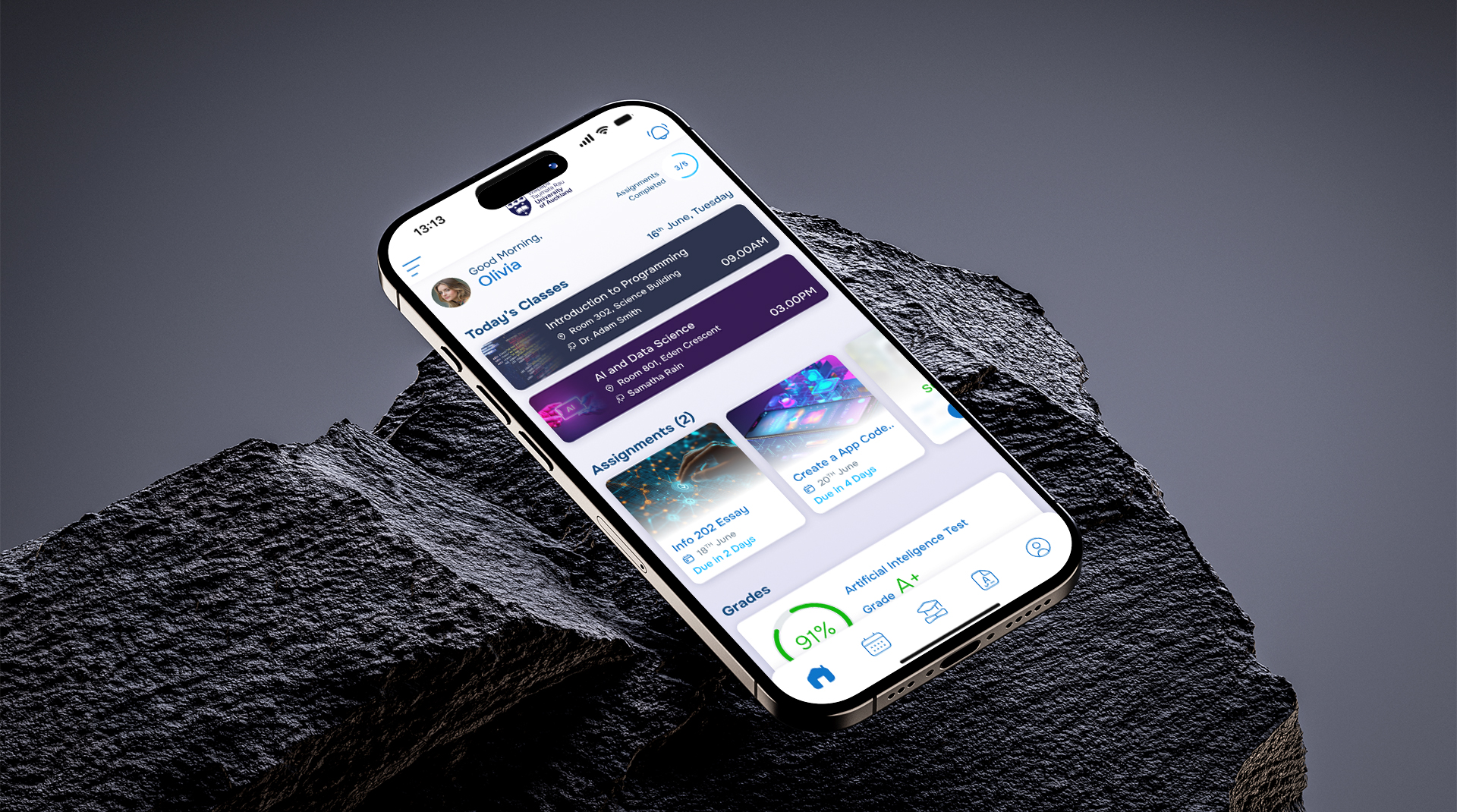
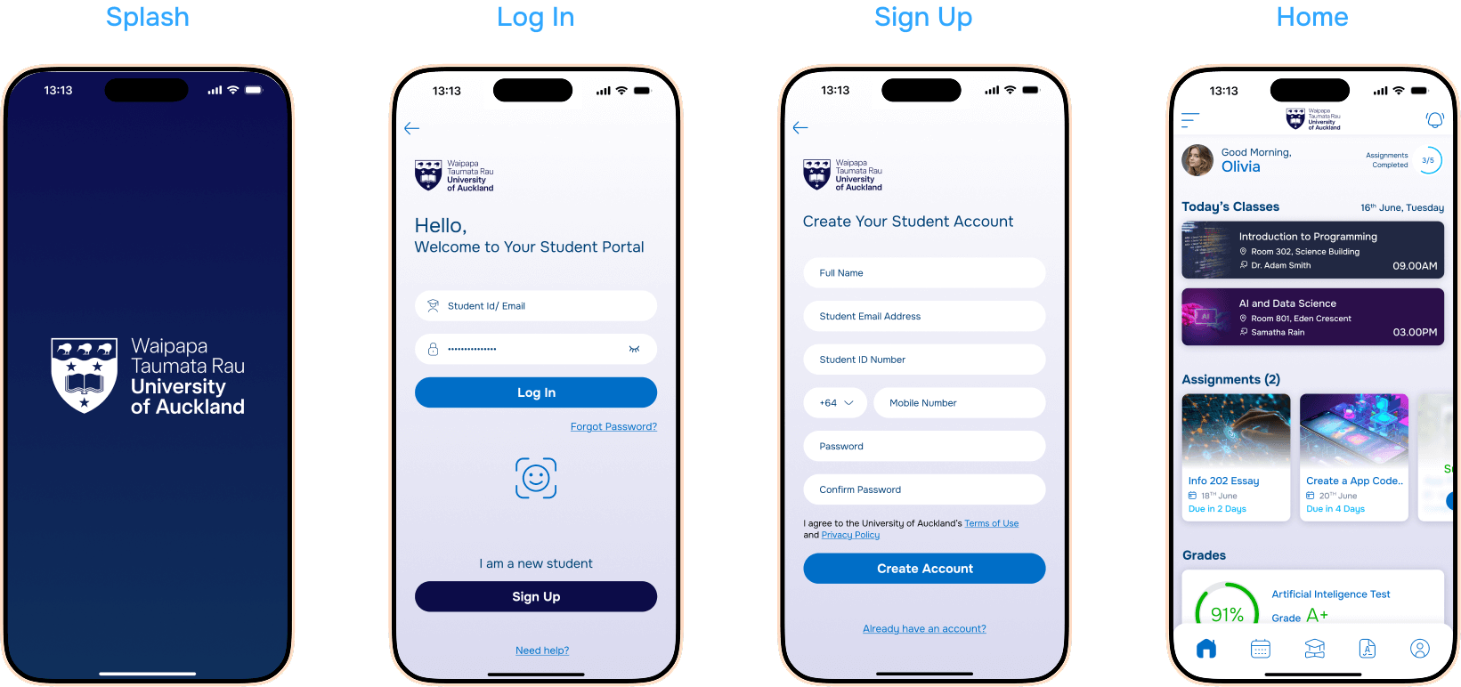
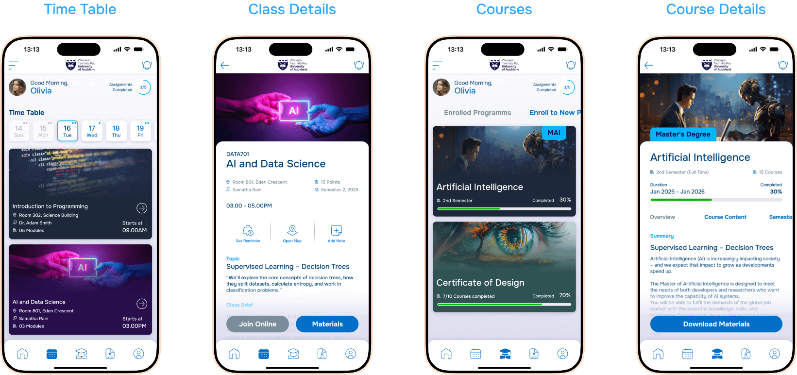
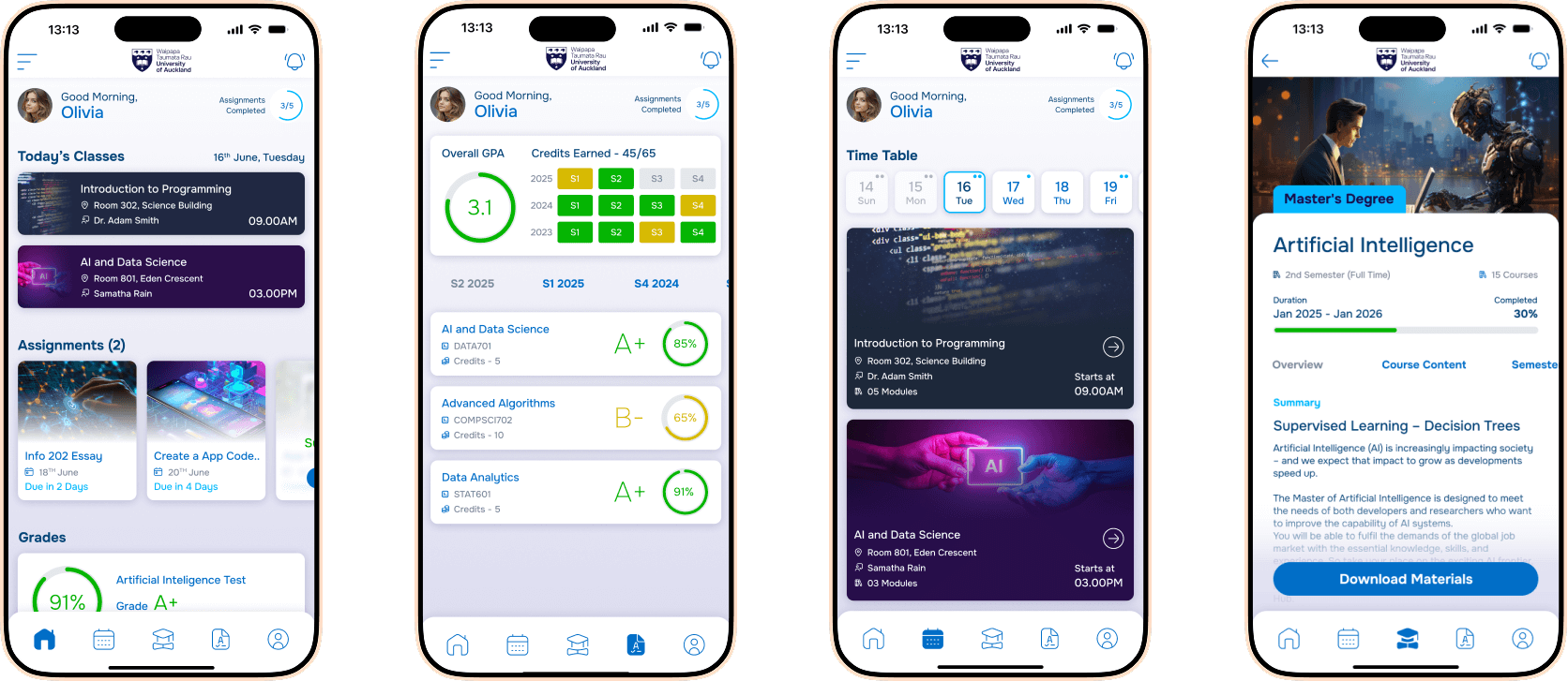
High-Fidelity UI Screens
After validating concepts through low-fidelity wireframes, I moved on to high-fidelity designs to bring the University of Auckland Student Portal mobile app to life. These designs focused on visual clarity, consistency, and usability, incorporating the university’s branding, a cohesive color palette, and typography hierarchy to guide users effortlessly through the app. Interactive elements such as buttons, menus, and notifications were refined for intuitive interactions, while student priorities like accessing academic records, schedules, and campus updates remained front and center. High-fidelity prototypes allowed for realistic usability testing, helping to uncover subtle friction points and validate design decisions before development, ensuring the final product was both visually appealing and highly functional.
Results & Key Metrics
| Key Metric | Before | After | Impact |
|---|---|---|---|
| Mobile Navigation Efficiency | 45% | 90% | Users find information faster and with fewer taps |
| Time to Access Academic Records | 3–5 minutes | 30–60 seconds | Significantly reduced time to access grades and course info |
| Student Satisfaction Score | 62% | 88% | Improved overall user satisfaction with the portal |
| Task Completion Rate | 70% | 95% | Students can complete key tasks more successfully |
| Frequency of Missed Notifications | 40% | 10% | Proactive notifications ensure students stay informed |
| Average Session Duration | 6 min | 3 min | Students can achieve tasks faster with less frustration |
| Return Visits | 50% | 75% | Higher engagement due to improved usability and clarity |
| User Error Rate | 25% | 5% | Clearer UI reduces mistakes and confusion |
| Feature Discoverability | 55% | 90% | Students can easily find new or important features |
| Overall UX Rating | 3.2/5 | 4.6/5 | Enhanced user experience across the portal |
Before and After Results
Before
After
Key Highlights
50
%Reduced task time for accessing timetables
85
%users preferred the new design over the old portal
91
%found the notifications feature “very useful”
85
%task completion rate on first try
78
%reduction in steps required to complete key tasks like checking timetables and viewing grades.
4.5
/5User Satisfaction Rating improved
Working with Hasaruwan and his team on the University of Auckland Student Portal mobile app has been a truly transformative experience. The level of thoughtfulness and attention to detail in both the UX research and design was exceptional. They not only addressed the technical challenges but deeply understood the needs of our students, turning complex workflows into an intuitive and seamless mobile experience. The app has significantly improved student engagement, reduced navigation frustration, and made accessing academic information far more efficient. Their collaborative approach, professionalism, and commitment to user-centered design have exceeded our expectations, and we are thrilled with the outcome.

Head of Student Experience
Conclusion & Key Takeaways
The redesign of the University of Auckland Student Portal mobile app successfully transformed a functional but cumbersome platform into a seamless, student-centered experience. By combining user research, persona development, journey mapping, and iterative design, we were able to simplify navigation, prioritize critical student needs, and introduce proactive features like notifications and an integrated calendar. As a designer, the key takeaways from this project include the importance of empathizing with diverse user needs, the value of early and iterative testing, and the impact of clear information hierarchy and visual consistency on usability. This project reinforced the power of data-driven design decisions and the significance of creating solutions that not only look good but also genuinely enhance daily user experiences.