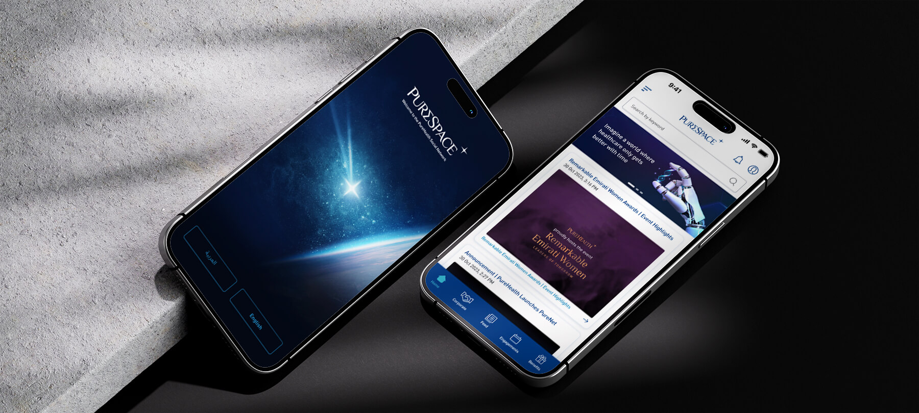
PureSpace is a mobile application developed to optimize healthcare corporate operations by providing executives and operations teams with real-time insights into hospital performance, resource utilization, and employee workflows. The project focused on creating a responsive, intuitive mobile interface that transforms complex operational data into actionable insights. Key metrics were prioritized, and information was consolidated to reduce cognitive load, enabling users to quickly assess operational status and take immediate action. Interactive elements and contextual alerts guide users to critical decisions, while role-specific dashboards ensure executives, managers, and staff can access the information most relevant to their responsibilities. The design also emphasized clarity, scalability, and consistency to support high-pressure, fast-paced decision-making environments. By simplifying complex datasets, streamlining workflows, and enhancing situational awareness, PureSpace empowers healthcare teams to make faster, more informed decisions, reduce operational friction, and improve overall efficiency across facilities.
Introduction
Client
PureSpace (Healthcare Corporate)
Type
Mobile Application Design / UX & UI Design
Industry
Healthcare / Corporate Operations
Role
Lead UI/UX Designer | Mobile UX Strategist | Interaction Designer | Visual Designer
Technologies

Problem Statement
Key Challenges
Fragmented Operational Data
Teams needed to access multiple data sources in real-time but existing tools were siloed and cumbersome.
High Cognitive Load
Complex dashboards and dense information caused fatigue and slowed decision-making.
Limited Mobile Access
Content: Existing systems were desktop-centric, reducing accessibility for mobile users.
Delayed Response to Critical Events
Without real-time alerts, teams struggled to prioritize and respond efficiently.
Key Design Objectives
Centralized Operational Dashboard
Consolidate key metrics and insights in a single, accessible mobile dashboard.
Simplify Data Visualization
Use clear, digestible visuals and indicators to reduce cognitive load.
Optimize Mobile Experience
Ensure responsive, intuitive mobile design for on-the-go decision-making.
Real-Time Alerts & Notifications
Real-Time Alerts & Notifications
User Research
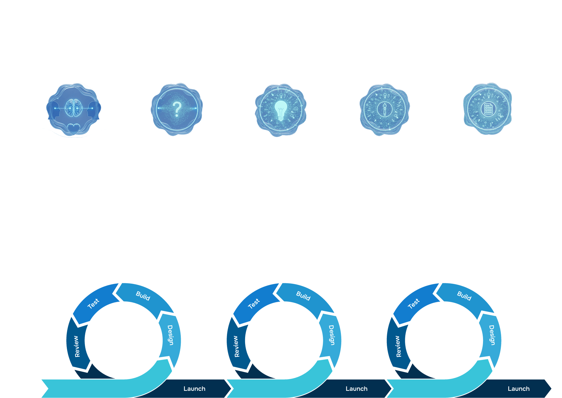
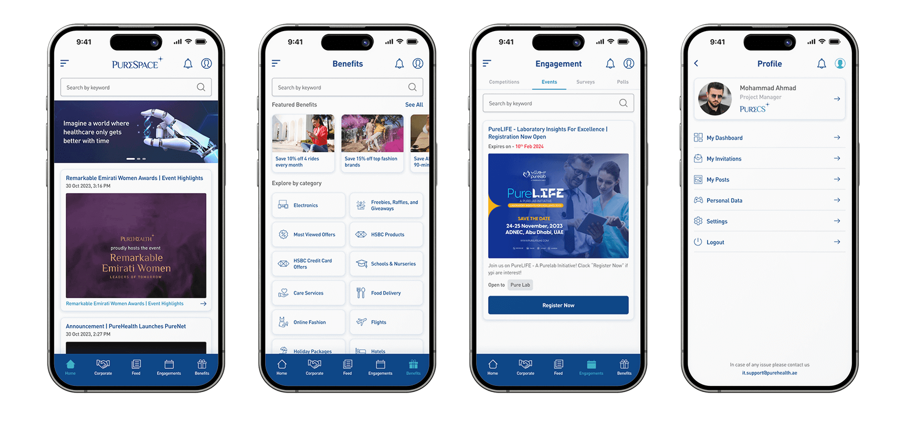
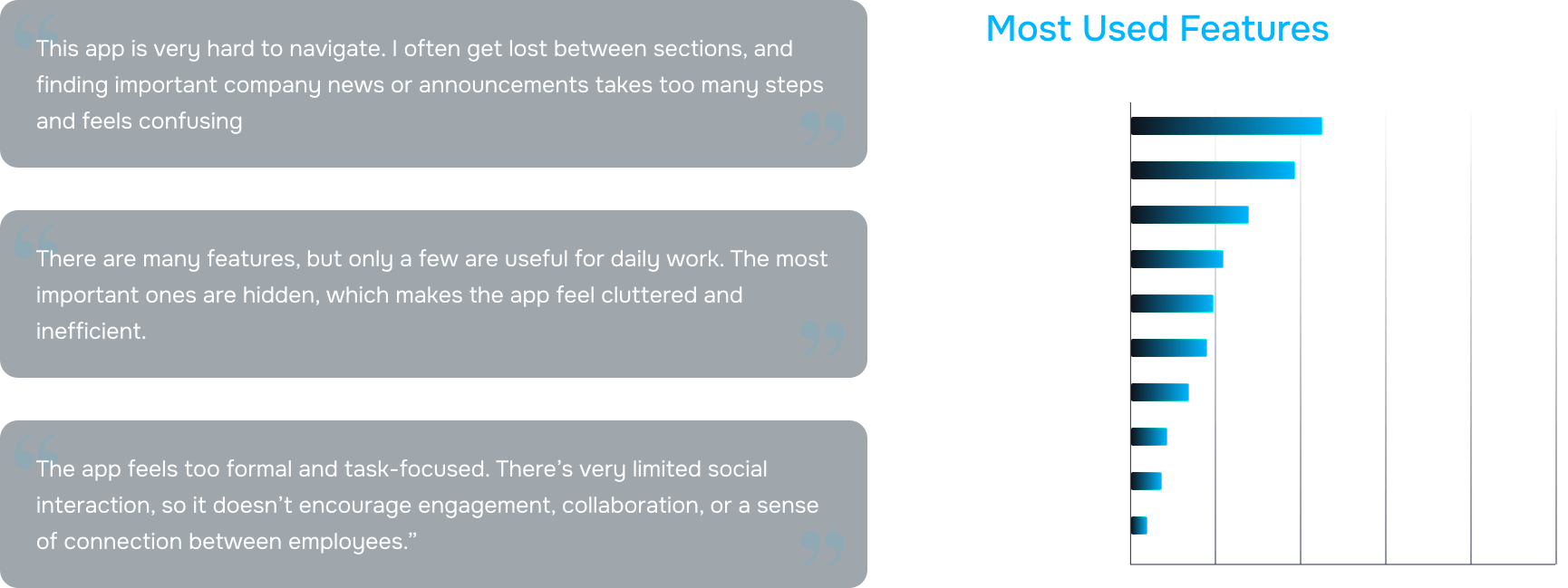
The user research for PureSpace involved a combination of interviews, surveys, observations, usability tests, and competitive analysis to understand the needs of healthcare corporate teams. Operations managers highlighted challenges in accessing real-time performance metrics across multiple systems, while corporate staff reported difficulty using desktop-centric tools during on-the-go tasks. Observational studies revealed high cognitive load due to cluttered dashboards and complex data visualization, causing users to miss critical alerts. Usability testing further confirmed that users struggled to locate key operational metrics quickly, emphasizing the need for simplified navigation and intuitive prioritization. Feedback from executives stressed the importance of role-based dashboards that present actionable insights efficiently. Finally, competitive analysis showed that existing solutions lacked mobile-first accessibility, real-time alerts, and visual clarity, highlighting opportunities for PureSpace to provide a more effective and user-centric mobile platform.
1
%Interviews with operations managers revealed difficulty tracking performance metrics in real-time.
2
%Surveys indicated frustration with multiple systems and lack of mobile accessibility.
3
%Observations showed high cognitive load due to complex dashboards and redundant information.
4
%Usability tests highlighted difficulties in locating critical alerts quickly.
5
%Feedback from executives emphasized the need for role-specific dashboards for quicker decision-making.
6
/5Competitive analysis identified gaps in mobile features for healthcare operational tools.
User Personas
User Journey Map
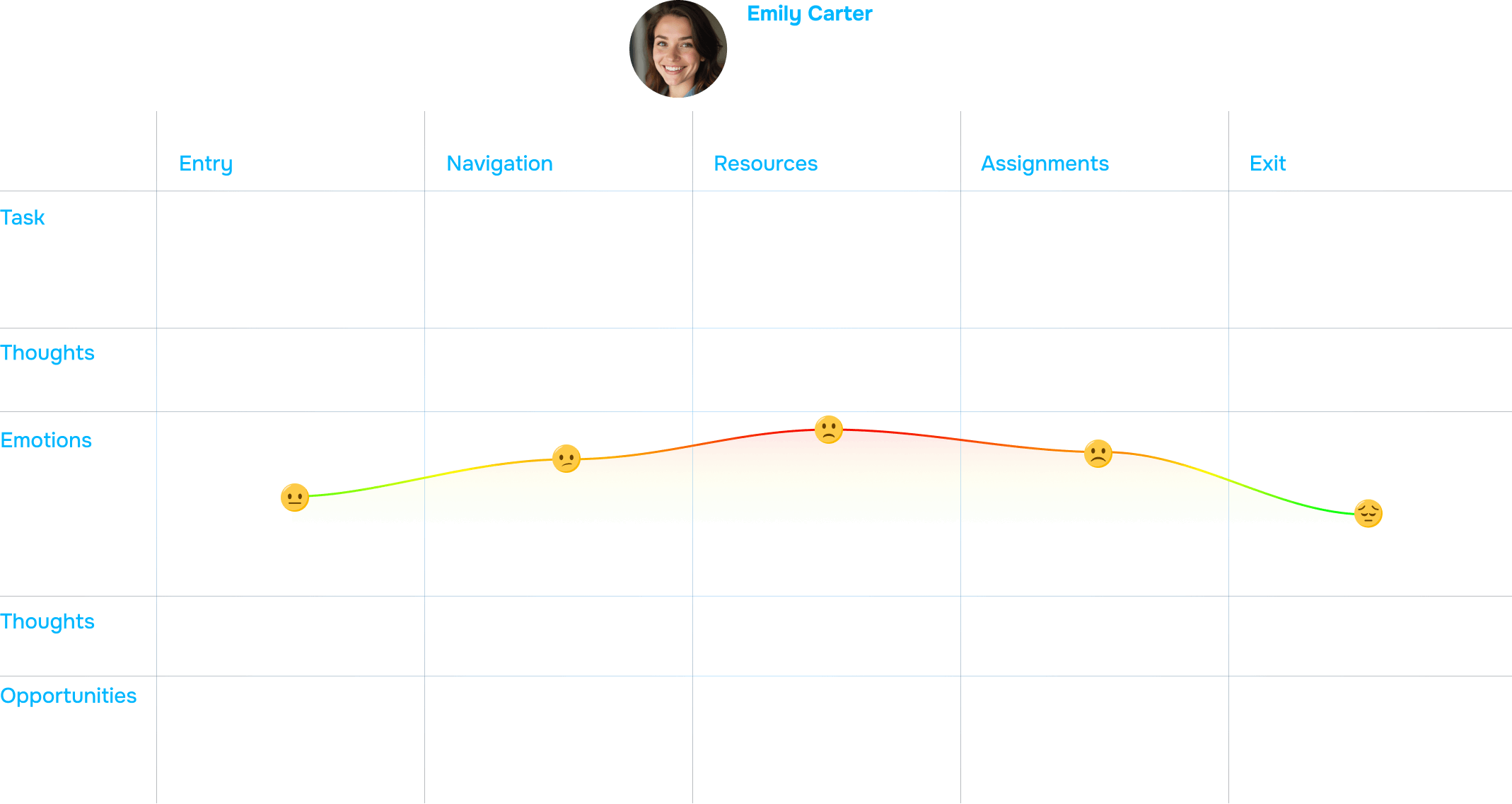
I meticulously mapped end-to-end user interactions, tracing the complete journey from the moment an operational alert is received to the point where a decision-driven task is successfully executed. This comprehensive mapping enabled the identification of critical pain points, workflow bottlenecks, and moments where excessive information or ambiguous processes created inefficiencies. By examining each touchpoint in detail, I uncovered opportunities to simplify tasks, streamline decision-making, and minimize cognitive load for users. These insights directly informed the design of intuitive, role-specific workflows and prioritized alert systems, ensuring that essential information was presented clearly and in context. Additionally, the mapping guided the development of actionable interfaces that empower users to respond swiftly and accurately to operational events. The result is a more efficient, confident, and error-resistant user experience, where complex operational processes are transformed into manageable, understandable, and responsive workflows that align with real-world user needs.
Design Screens
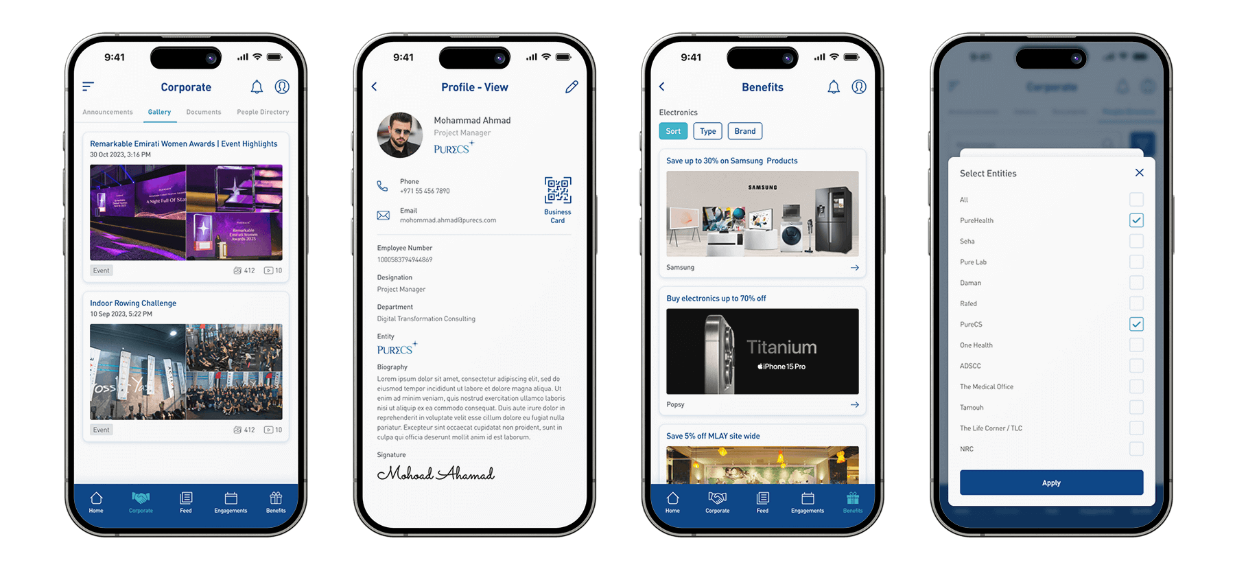
I designed comprehensive wireframes and high-fidelity screens for dashboards, alert notifications, task management modules, and role-specific interfaces, ensuring that every touchpoint within the platform was both functional and visually coherent. Each design prioritized clarity, intuitive information hierarchy, and consistent visual language, enabling users to quickly grasp essential data and take informed actions. By standardizing components, layouts, typography, and interaction patterns, the interfaces reduced cognitive load for healthcare staff and promoted efficiency in complex operational workflows. The designs also emphasized responsive layouts and clear visual cues, allowing seamless navigation across desktop, tablet, and mobile devices. Role-specific considerations guided the presentation of data for executives, managers, and operational teams, ensuring that each user could access actionable insights relevant to their responsibilities. Micro-interactions, color coding, and alert prioritization further enhanced usability, supporting fast decision-making, task tracking, and overall operational effectiveness across the healthcare environment.
Low-Fidelity Wireframes
I created sketches and low-fidelity wireframes that prioritized layout, navigation, and critical workflows, focusing on how users would interact with the system rather than detailed visual styling. This early-stage exploration allowed for rapid iteration on information hierarchy, task flows, and interface structure, ensuring that the core user journey was intuitive and efficient before moving into high-fidelity visual design. By testing these wireframes with stakeholders, I was able to identify pain points and optimize workflows early in the design process.
High-Fidelity UI Screens
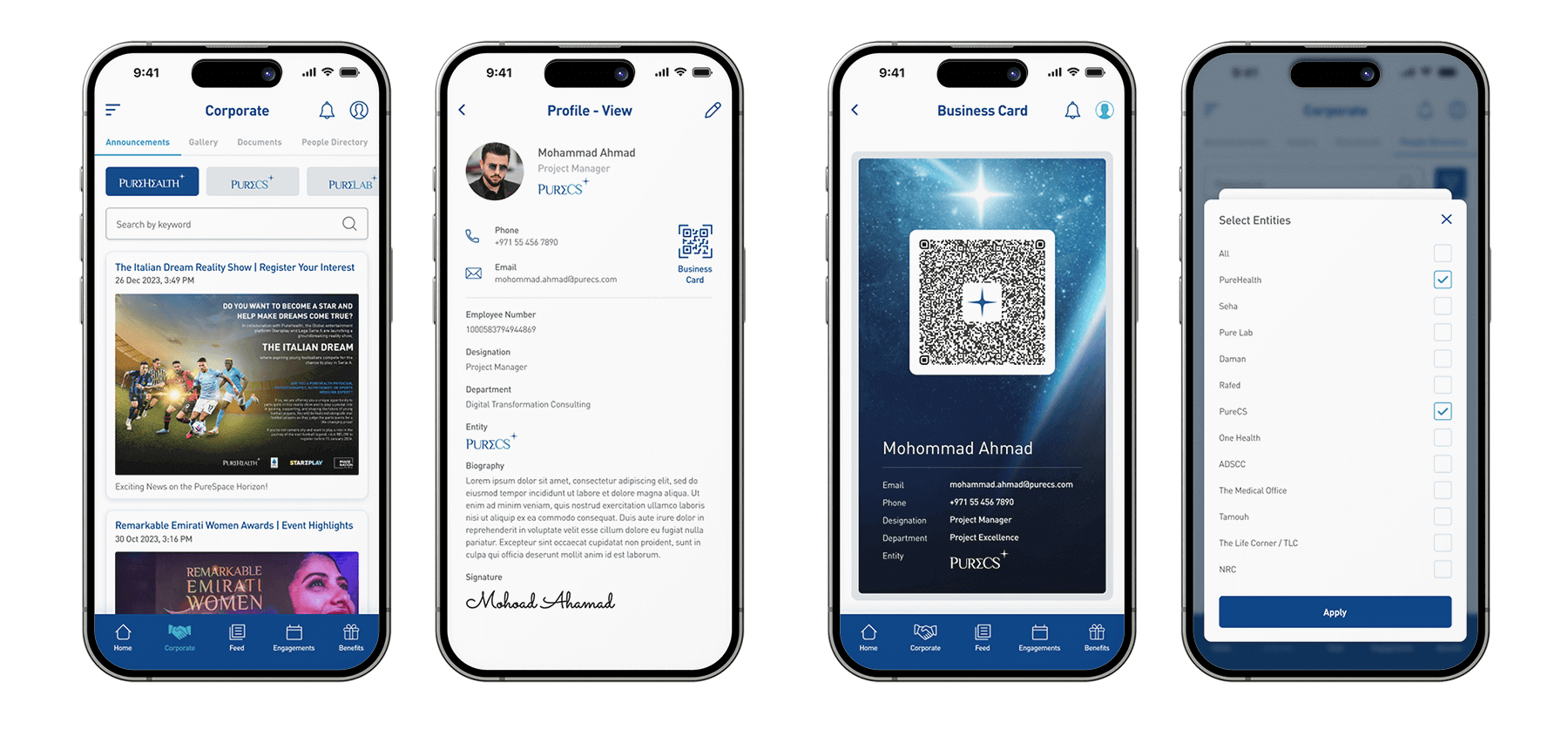
I developed high-fidelity screens that integrated brand colors, typography, icons, and micro-interactions to create a cohesive, engaging, and professional interface. The designs were grounded in real operational data, ensuring that dashboards, alerts, and task flows were both functional and intuitive. By applying a clear visual hierarchy and carefully crafted interactive elements, I enhanced usability, allowing users to quickly interpret critical information, take decisive action, and navigate complex workflows with confidence. This approach balanced aesthetic appeal with practicality, ensuring that the interface was not only visually compelling but also highly effective in supporting decision-making, reducing cognitive load, and improving operational efficiency across healthcare teams.
Results & Key Metrics
| Metric | Impact |
|---|---|
| Decision-Making Speed | 35% faster for operational teams |
| Cross-Department Collaboration | 24% improvement due to integrated communication |
| Cognitive Load | 48% reduction for users interpreting operational data |
| Mobile Adoption | 40% increase in active mobile users |
| Incident Response Time | 30% faster handling of critical events |
| Task Completion Efficiency | 25% improvement in completing operational tasks |
Before and After Results

Before

After
Key Highlights
1
%Consolidated dashboards for real-time visibility across departments.
2
%Role-based interfaces to provide actionable insights specific to user responsibilities.
3
%Mobile-first design enabling decision-making on-the-go.
4
%Simplified data visualization reducing cognitive load.
5
%Real-time notifications and alerts for critical operational events.
8
/5Streamlined task management for operational efficiency.
"Hasaruwan’s design for PureSpace has revolutionized how our operations teams monitor and respond to critical healthcare events. The mobile interface is intuitive, visually clear, and makes complex data easily actionable. We’ve seen measurable improvements in efficiency and response time.”

Head of Corporate Communications
Conclusion & Key Takeaways
This project demonstrates how a mobile-first, user-centered design approach can significantly improve healthcare corporate operations. By integrating role-based dashboards, streamlined visualizations, and real-time alerts, the app allows executives, managers, and staff to quickly interpret complex data and take informed actions. The design reduces cognitive load, prioritizes critical metrics, and supports efficient decision-making across departments. Interactive elements, clear hierarchies, and responsive layouts ensure that workflows are intuitive, actionable, and optimized for fast-paced healthcare environments. The key takeaway from this project is that thoughtful mobile design does more than present data—it transforms complex operational workflows into efficient, decision-driven processes, empowering healthcare teams to operate with clarity, confidence, and measurable impact.


