

Case Study 04
Hospital Command Center
A Centralized Dashboard for Real-Time Hospital Operations and Decision-Making

Client
Pure Health
Type
Dashboard Design / Enterprise UX / Data Visualization
Industry
Healthcare Technology
Role
Lead UI/UX Designer | UX Strategist | Data Visualization Designer | Interaction Designer | Design System Contributor
Introduction
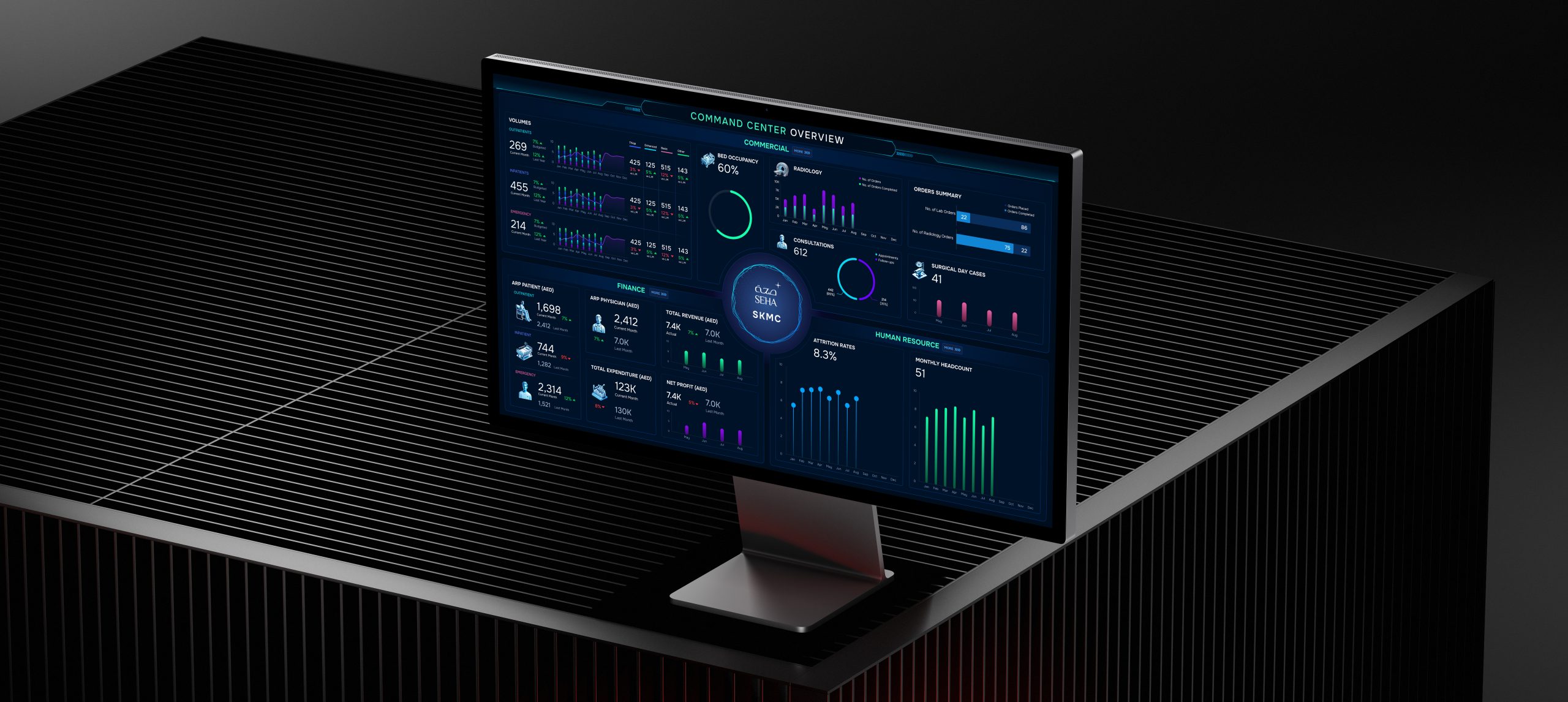
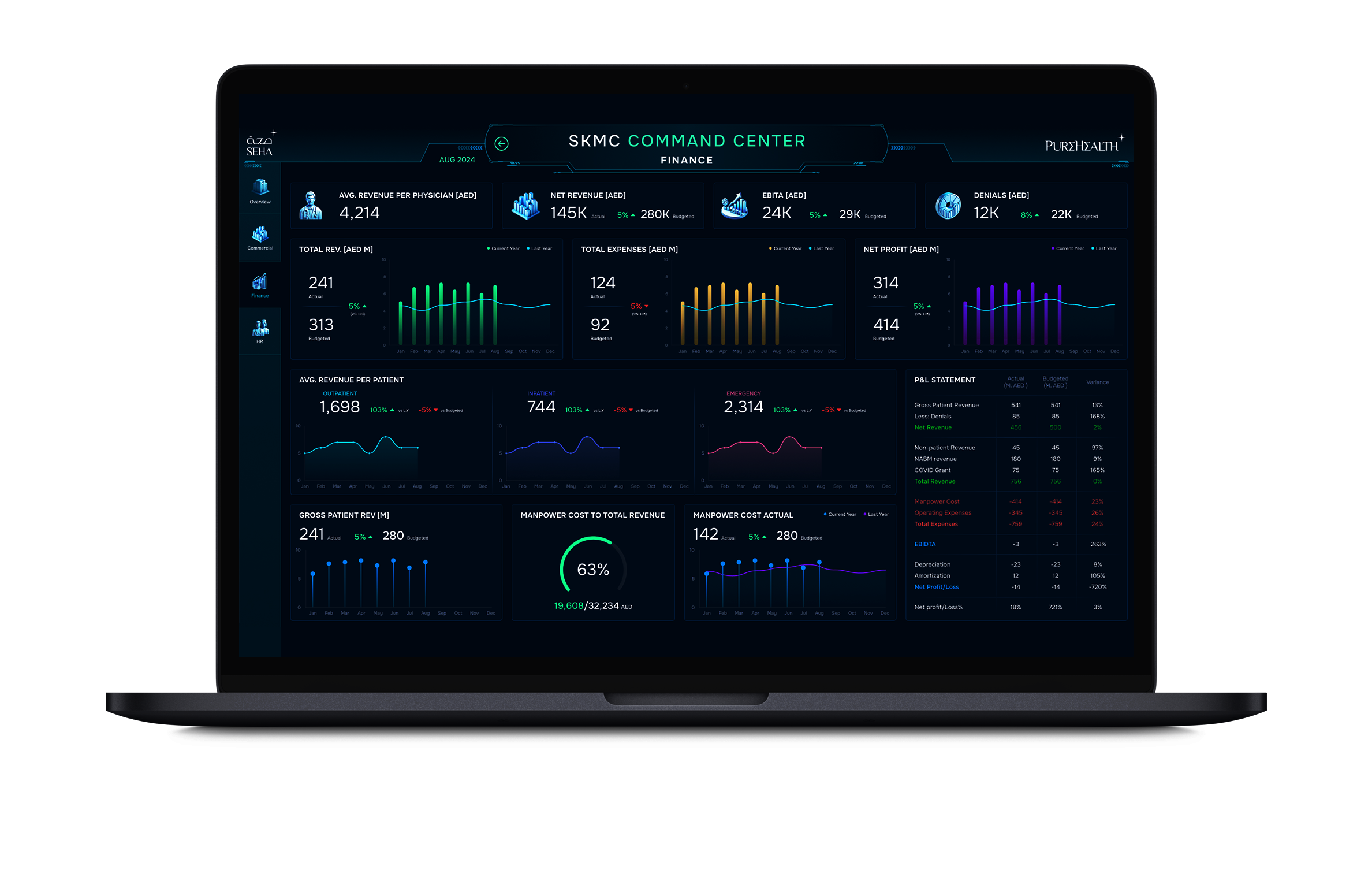
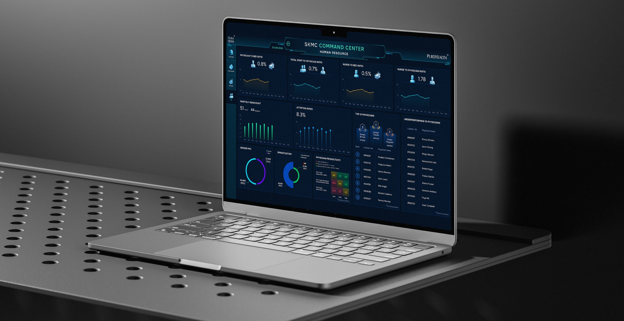
The Hospital Command Center is an enterprise-level healthcare dashboard designed to bring clarity and control to complex hospital operations. As a UI/UX Designer, I focused on translating scattered operational and clinical data into a cohesive, intuitive experience that executives, clinical managers, and operations teams can rely on in high-pressure situations. By combining thoughtful information hierarchy, interactive visualizations, and a clean interface, I helped create a platform that not only shows real-time performance metrics but also enables faster, smarter decision-making—supporting better patient care across multiple hospitals.
Technologies

Project Overview
The client needed a centralized system capable of integrating multiple hospital data streams into a single command center, providing instant visibility of key metrics like patient flow, bed occupancy, staffing, emergency load, and resource allocation. The challenge was presenting this volume of information without overwhelming users, while supporting high-pressure, time-sensitive decision-making.
I approached the project by designing a structured information architecture that prioritizes critical insights and guides users naturally through operational workflows. Using UX methods such as workflow mapping, user journeys, and interactive data visualizations, I simplified complex datasets and highlighted actionable insights. The UI leverages visual hierarchy, color coding, clear typography, and scalable components to ensure consistency, readability, and future adaptability as new facilities and metrics are added.
The final dashboard empowers healthcare leaders to quickly interpret operational status, respond to urgent situations, and optimize resources across hospitals. By reducing cognitive load and enhancing situational awareness, it provides a strategic advantage over traditional healthcare dashboards, strengthening organizational efficiency and patient care outcomes.
User Research & Pain Points
The organization faced several challenges that hindered effective operational oversight. Hospital teams lacked the ability to monitor real-time operations comprehensively, making it difficult to understand current performance or respond quickly to emerging issues. Data was fragmented across multiple systems, creating confusion and forcing staff to manually piece together information before taking action. Managing operations also placed a high cognitive load on teams, who had to track numerous alerts, metrics, and data points without a unified, streamlined interface. Additionally, the absence of predictive indicators meant that leaders were often reacting to issues rather than anticipating patient flow, resource needs, and operational demands. This highlighted the need for a centralized solution that could consolidate information, reduce mental workload, and enable more proactive planning and decision-making.
Key Solutions Implemented for Identified Problems
| Problem | Solution Implemented | Impact / Results | KPIs |
|---|---|---|---|
| Inability to monitor real-time operations | Unified Data Layer consolidating hospital metrics into a single dashboard | Instant visibility into critical hospital data | 35% faster decision-making |
| Fragmented and inconsistent data | Enhanced Visual Hierarchy with standardized UI and color-coded indicators | Reduced cognitive load and easier data interpretation | 48% reduction in cognitive load |
| Lack of predictive insights | Predictive Analytics Modules for patient flow and resource utilization | Proactive operational planning and issue prevention | 24% improvement in operational coordination |
| Difficult performance comparison across units | Interactive charts and heatmaps for unit comparisons | Faster trend identification and decision-making | 30% increase in data interpretation speed |
| Limited visibility into critical alerts | Real-Time Alert System with notifications and severity indicators | Reduced escalations and operational risks | 40% fewer escalations |
| Inconsistent UI components slowing adoption | Scalable Design System with reusable components | Accelerated onboarding and future scalability | Greater user satisfaction |

Technical Implementation
The dashboard was developed using a modular and scalable design system to support real-time data from multiple hospital units, ensuring flexibility as operational needs and metrics evolve. Figma was used to craft reusable components, maintain consistent typography, and implement color-coded alerts for quick identification of critical information. Interaction patterns were carefully optimized for rapid comprehension, leveraging visual hierarchy, micro-interactions, and integrated predictive analytics to guide decision-making. Close collaboration with backend developers ensured seamless integration of live hospital data, maintaining accuracy and reliability across the platform. UX research informed role-specific views tailored to the distinct needs of executives, operations managers, and clinical teams, allowing each user to access relevant insights efficiently. This combination of thoughtful design, technical alignment, and user-centered strategy resulted in a highly intuitive, data-driven interface that reduces cognitive load, accelerates response times, and empowers hospital staff to make informed, confident decisions.

Results & Key Metrics
| Results/Metric | Impact/ Description |
|---|---|
| Decision-Making Speed | 35% faster decision-making for hospital teams |
| Cognitive Load | 48% reduction in operator cognitive load |
| Data Interpretation Speed | 30% increase in speed for analyzing trends and metrics |
| Operational Coordination | 24% improvement in collaboration across units |
| Incident Escalations | 40% fewer escalations due to predictive alerts |
| User Satisfaction | Higher adoption and positive feedback from hospital staff |
The Hospital Command Center dashboard delivered measurable improvements across key operational areas. Decision-making speed increased by 35%, enabling hospital teams to respond quickly and confidently. Cognitive load for operators decreased by 48%, allowing staff to focus on critical tasks without distraction. Data interpretation speed improved by 30%, supporting faster analysis of trends, patient flow, and unit performance. Cross-departmental operational coordination rose by 24%, while incident escalations dropped by 40% thanks to predictive alerts and proactive insights. Overall user satisfaction also increased significantly, reflecting higher adoption rates and positive feedback from hospital staff. These outcomes demonstrate how a thoughtfully designed, data-driven dashboard can transform complex healthcare operations, improving efficiency, situational awareness, and patient care management across multiple facilities.
“Hasaruwan delivered an exceptional dashboard that transformed how we monitor and manage hospital operations. The interface is intuitive, visually appealing, and highly functional, enabling our teams to make faster, more confident decisions. His design approach simplified complex data and enhanced collaboration across departments. This dashboard has become an indispensable tool for our hospital management.”

Head of Digital Innovation — Pure Health
Conclusion & Key Takeaways
This project underscored the critical importance of clarity, usability, and strategic design in high-stakes healthcare environments where timely decisions can directly impact patient outcomes. By combining a structured UX strategy with predictive analytics and a scalable, modular visual design system, I was able to transform complex operational and clinical data into a cohesive, actionable dashboard. Key design decisions—such as establishing clear information hierarchy, role-specific views, and interactive data visualizations—helped reduce cognitive load for executives, operations teams, and clinical staff, enabling them to interpret data quickly and act with confidence. The integration of predictive indicators and real-time alerts further enhanced situational awareness, supporting proactive management of patient flow, staffing, and resource allocation. This experience reinforced the value of designing for both usability and insight, demonstrating how thoughtful UI/UX can turn overwhelming hospital data into intelligent, decision-driving tools that improve operational efficiency and elevate patient care.