Client
Purehealth
Type
Dashboard
Industry
Healthcare
Role
UI/UX designer, UX Researcher, Strategy Architect
Introduction
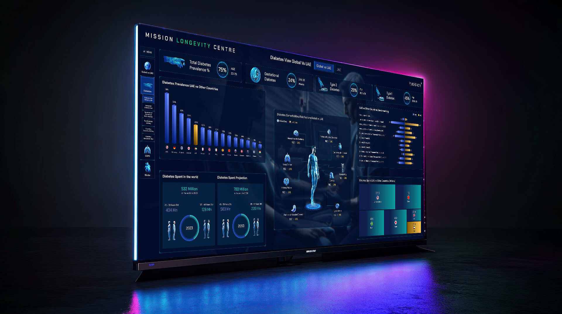
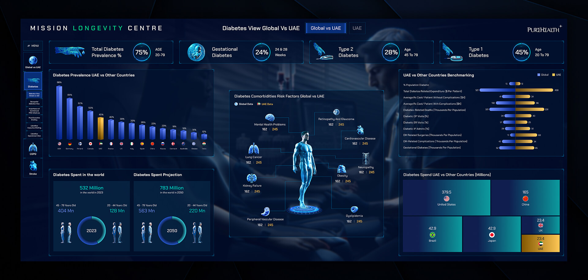
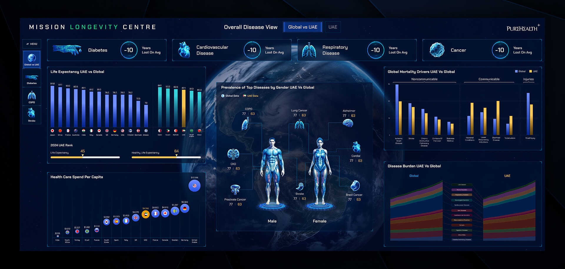
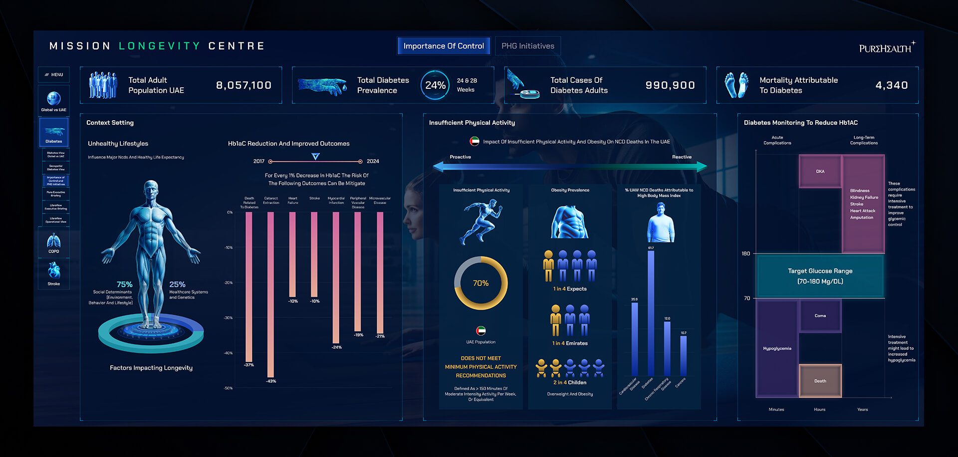
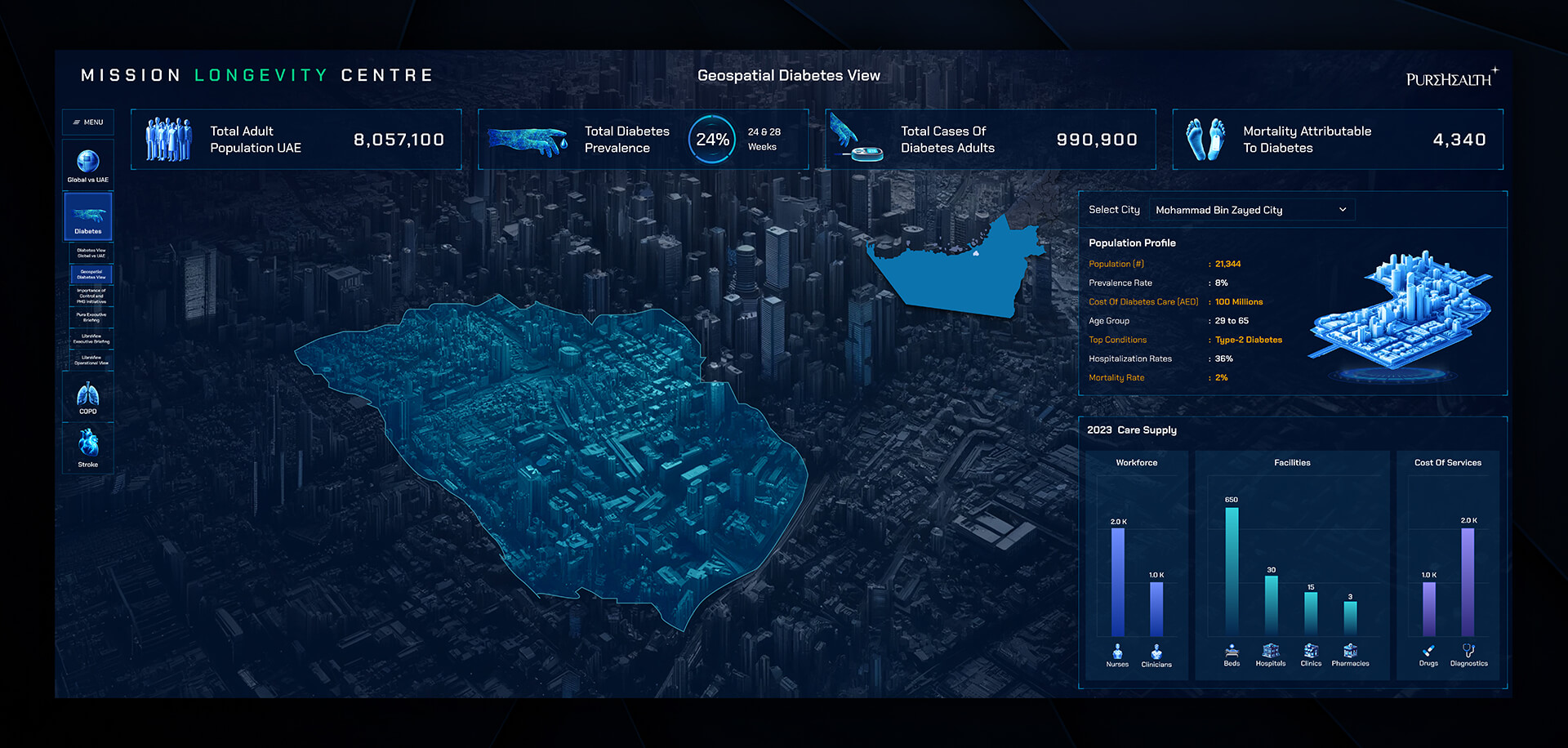
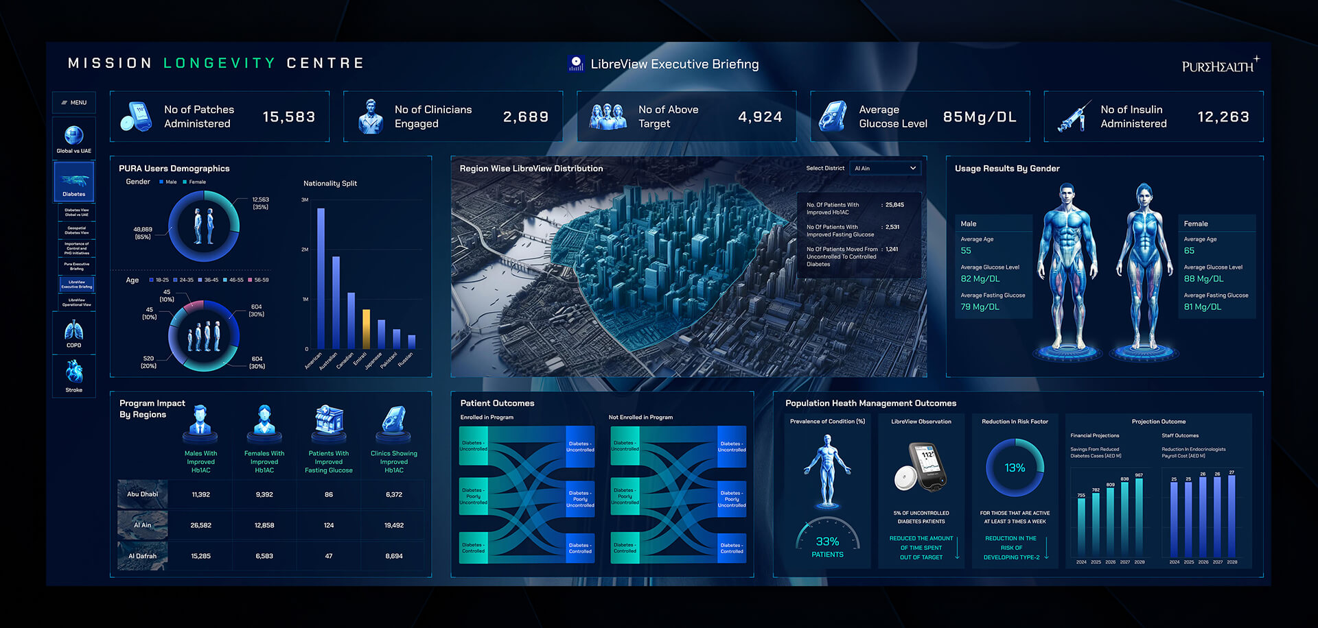
Mission Longevity Center is a comprehensive healthcare dashboard built to provide real-time, actionable insights and enhance operational efficiency across the facility. In this project, I worked as a UX/UI Designer, transforming complex clinical and operational data into a visually clear and intuitive platform. My goal was to create an interface that empowers healthcare professionals to monitor patient care seamlessly, track resource utilization accurately, and make informed decisions with confidence. By combining interactive visualizations, a logical information hierarchy, and responsive design, the dashboard ensures that critical data is immediately understandable and easily accessible, helping staff respond faster, reduce errors, and optimize workflows across the center.
Technologies

Project Overview
The client required a high-performance dashboard capable of consolidating data from multiple sources while presenting it in an understandable and actionable format. My role involved user research, UX strategy, and interface design, ensuring that the dashboard not only looked clean and modern but also enhanced workflow efficiency.
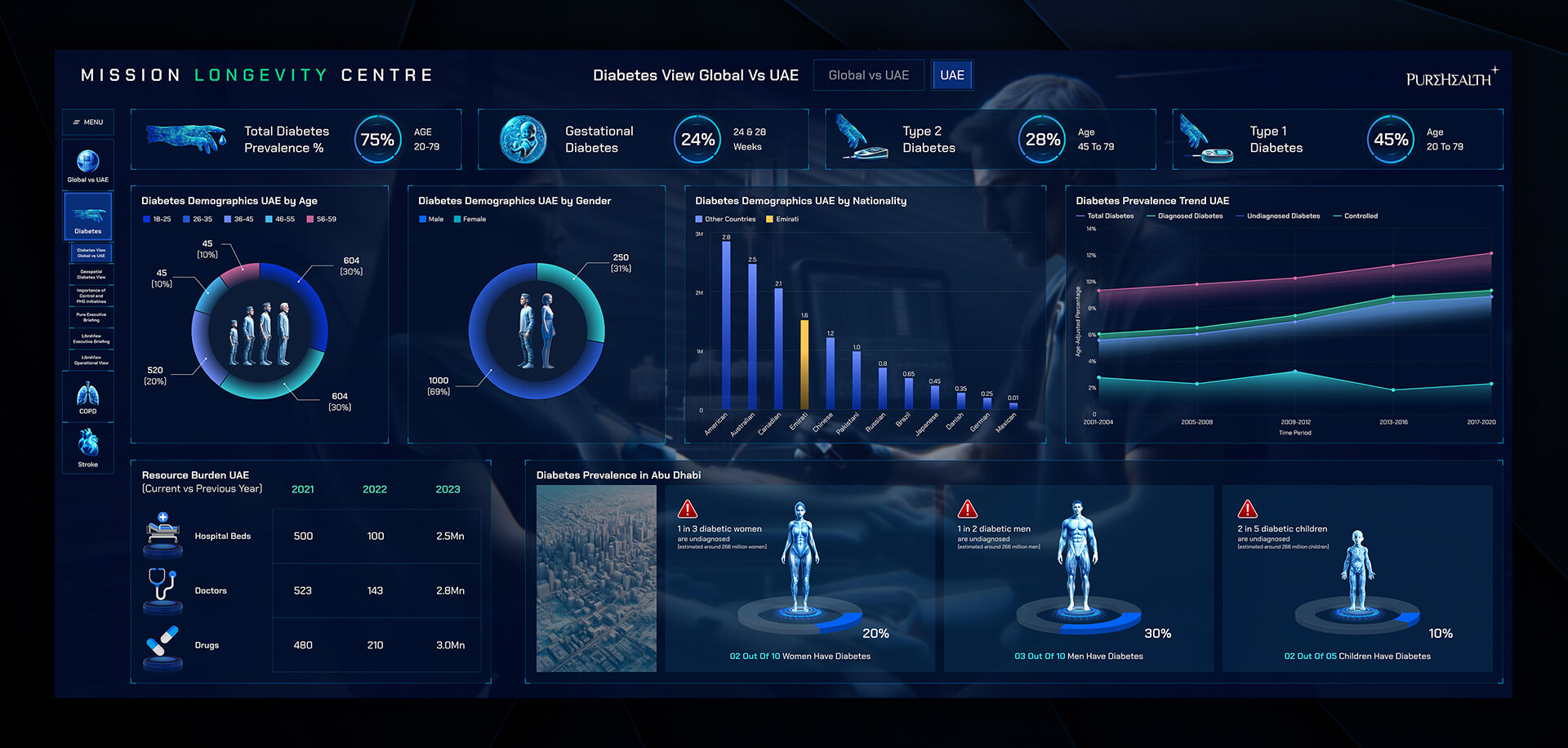
I focused on creating an intuitive layout, logical information hierarchy, and interactive visualizations that allow users to drill down into details without being overwhelmed. Color-coded alerts, trend graphs, and performance indicators highlight key metrics at a glance. The design also prioritized accessibility, responsiveness, and consistency across devices, enabling staff to access real-time insights on desktops, tablets, or large-scale monitors. By combining modern design principles with healthcare-specific UX best practices, this dashboard empowers the team to track operational performance, manage patient care effectively, and identify bottlenecks quickly.
User Research & Pain Points
Through a series of interviews and observational research sessions with healthcare staff, several critical pain points became clear. Users struggled to monitor multiple patient metrics in real-time, often feeling overwhelmed by complex data visualizations that were difficult to interpret. Tracking resource utilization and identifying bottlenecks in patient care was slow and cumbersome, and there was no unified view that combined operational and clinical data. These insights became the foundation for designing a dashboard that simplifies monitoring, enhances clarity, and provides a cohesive overview of both patient and operational metrics.
Key Solutions Implemented for Identified Problems
| Problem | Solution Implemented | Impact / Results | KPI |
|---|---|---|---|
| Difficulty monitoring multiple patient metrics | Created a unified dashboard with customizable widgets for patient monitoring | Users can view critical metrics at a glance, reducing response time | Average response time to alerts reduced by 30% |
| Complex visualizations were confusing | Redesigned charts and graphs with clear legends, color-coding, and drill-down functionality | Improved comprehension and reduced errors in interpreting data | User comprehension improved by 40% |
| Tracking resource utilization was slow | Implemented real-time analytics and KPI tracking for beds, staff, and equipment | Enhanced resource allocation efficiency | Resource utilization efficiency increased by 25% |
Technical Implementation
The dashboard was built using React.js for the frontend and Node.js with PostgreSQL for the backend. Data visualizations were implemented using D3.js and Chart.js, ensuring interactive and responsive charts. The system integrates with existing hospital data sources via secure APIs, providing real-time updates while adhering to healthcare data compliance standards. Role-based access ensures sensitive information is available only to authorized staff.
Results & Key Metrics
| Result / Metric | Impact / Description |
|---|---|
| Response time to patient alerts | Reduced by 30%, enabling faster intervention |
| Comprehension of dashboard data | Improved by 40%, decreasing errors in decision-making |
| Resource utilization efficiency | Increased by 25%, optimizing staff and equipment allocation |
| User engagement | High adoption rate with 90% of staff using the dashboard daily |
After implementation, the Mission Longevity Center dashboard significantly improved operational efficiency and data-driven decision-making. Response times to critical patient alerts decreased by 30%, while comprehension of complex metrics increased by 40%. Real-time resource tracking enhanced the allocation of staff and equipment by 25%, and overall user engagement was high, with over 90% of staff adopting the platform daily. These outcomes demonstrate the dashboard’s effectiveness in streamlining workflows and supporting informed healthcare decisions.
"The new dashboard has transformed how we monitor patient care and operational performance. Hasa’s design is intuitive, visually clear, and helps our team respond faster and make better decisions."
Head of Digital Innovation — Purehealth
Conclusion & Key Takeaways
This project highlights the critical role of user-centered design in healthcare. By deeply understanding staff needs and pain points, I designed a dashboard that strikes a balance between functionality, clarity, and responsiveness. Unified dashboards simplify monitoring and support faster decision-making, while interactive visualizations make complex data easier to comprehend. Real-time insights enhance operational efficiency and optimize resource allocation, and consistent design principles ensure the platform is adopted seamlessly across multiple devices. The Mission Longevity Center dashboard demonstrates how thoughtful UX/UI design can drive meaningful improvements in both operational performance and patient care outcomes.


