

Case Study 07
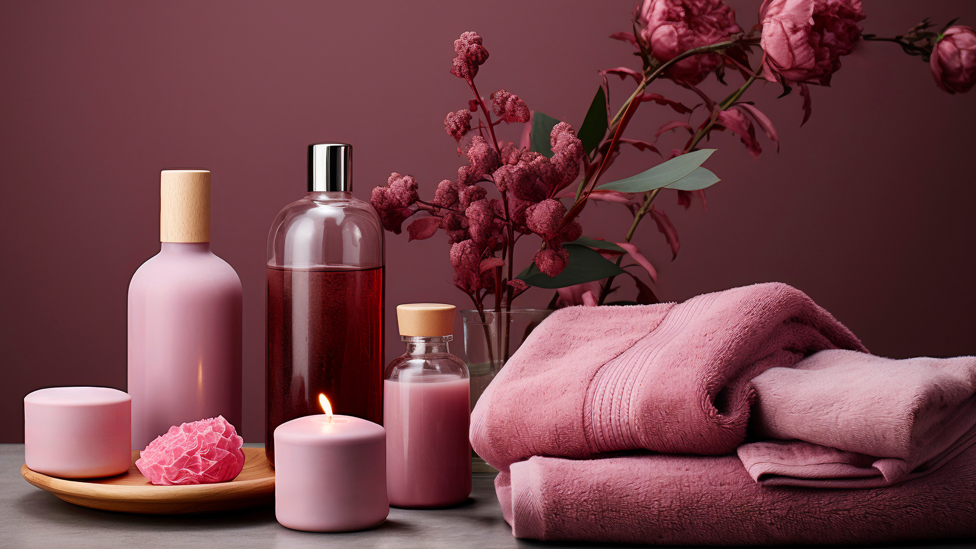
Pink Zebra
A Modern E-Commerce Platform for Home Fragrance and Lifestyle Products
Client
Pink Zebra
Type
Website Design / E-Commerce UX & UI Design
Industry
Home Fragrance / Lifestyle / E-Commerce
Role
Lead UI/UX Designer | UX Strategist | Visual Designer | Interaction Designer | Frontend Collaboration
Introduction
Pink Zebra is an e-commerce platform specializing in home fragrance, décor, and lifestyle products, designed to capture the brand’s playful and vibrant personality. In this project, I worked as a UI/UX Designer, creating a digital experience that blends visual delight with functional ease. My focus was on guiding users smoothly from product discovery to purchase, ensuring that navigation, content presentation, and interactive elements feel intuitive and enjoyable across all devices. The goal was to make shopping effortless while highlighting the unique charm and quality of each product, reflecting the brand’s essence in every interaction.


Project Overview
Pink Zebra needed a modern, responsive website that could showcase its range of products while driving sales and engagement. My role involved UX research, UI design, and interaction design, focusing on simplifying product discovery and creating an immersive shopping journey.
I began by analyzing user behaviors, preferences, and pain points to inform a design strategy that balances aesthetics with usability. Clear navigation, structured content, and strategically placed calls-to-action guided users naturally from browsing to purchasing. Product pages were optimized with high-quality imagery, detailed descriptions, and visual cues to support decision-making, while the checkout flow was streamlined to reduce friction and increase conversion rates.
Interactive elements, subtle animations, and responsive layouts ensure a cohesive experience across desktop, tablet, and mobile devices. Modern e-commerce principles such as visual hierarchy, accessibility, and persuasive design were applied to make the site both functional and engaging.
The result is a platform that not only enhances the user experience but also strengthens the Pink Zebra brand, increases engagement, and delivers measurable improvements in online sales. By combining playful aesthetics with thoughtful design, the website turns shopping into an enjoyable and memorable experience.

User Research & Pain Points
Users faced several challenges that limited their ability to shop efficiently on the previous platform. Complex navigation made it difficult to find products, while unclear product categorization and filtering options caused confusion during browsing. The checkout process was lengthy and lacked clarity, often leading to abandoned carts and reduced conversions. Additionally, limited mobile optimization negatively impacted usability, making it challenging for users to browse and purchase products on smartphones and tablets. These issues highlighted the need for a user-centered redesign that simplifies navigation, improves product discovery, streamlines checkout flows, and delivers a fully responsive, mobile-friendly experience to enhance engagement and drive online sales.

Key Solutions Implemented for Identified Problems
| Problem | Solution Implemented | Impact / Results | KPIs |
|---|---|---|---|
| Difficulty finding products | Intuitive navigation and simplified menu with clear categories | Users can locate products quickly and efficiently | 20% increase in product page views |
| Confusing product categorization | Organized product filters and sorting options | Improved product discovery and reduced search time | 25% increase in filtered searches |
| Lengthy checkout process | Streamlined multi-step checkout with progress indicators | Reduced cart abandonment and faster purchases | 30% increase in completed orders |
| Poor mobile usability | Fully responsive mobile-first design | Enhanced mobile shopping experience | 40% increase in mobile conversions |
| Lack of engaging visuals | High-quality images, banners, and product storytelling | Increased engagement and improved brand perception | 35% increase in time on page |
| Inconsistent UI | Standardized design system with reusable components | Consistent brand experience and improved usability | Higher user satisfaction and retention |

Technical Implementation
The Pink Zebra website was developed using a mobile-first design approach to deliver a seamless experience across smartphones, tablets, and desktops. Wireframes, interactive prototypes, and a reusable design system were created in Figma to ensure consistency, scalability, and efficiency throughout the design process. Key interface elements, including navigation menus, filtering options, and product pages, were optimized for usability, allowing users to explore and discover products quickly and intuitively. Interaction design focused on enhancing engagement through visual cues, micro-interactions, and clear calls-to-action that guide users through the browsing and purchasing journey. Close collaboration with developers ensured smooth integration with the content management system, checkout systems, and other e-commerce functionalities, while maintaining performance and scalability for future growth. This approach resulted in a cohesive, responsive, and user-friendly platform that simplifies product discovery, supports efficient purchasing, and reinforces the Pink Zebra brand experience online.


Results & Key Metrics
| Metric | Impact |
|---|---|
| Product Page Views | 20% increase in user exploration of products |
| Filtered Searches | 25% increase in users finding relevant products |
| Completed Orders | 30% increase in successful transactions |
| Mobile Conversions | 40% increase due to responsive design |
| Time on Page | 35% increase from enhanced visuals and storytelling |
| User Satisfaction | Higher engagement and positive feedback |
The Pink Zebra website delivered measurable improvements across key performance metrics. Product page views increased by 20%, while filtered searches grew by 25%, making it easier for users to find relevant products efficiently. Completed orders rose by 30%, and mobile conversions improved by 40%, reflecting the impact of a responsive, mobile-first design. Average time on page increased by 35% due to engaging visuals, product storytelling, and intuitive layouts, while overall user satisfaction saw a significant boost, demonstrating higher engagement and a consistent, enjoyable brand experience. These results highlight how thoughtful UI/UX design, responsive layouts, and clear information architecture can enhance discoverability, drive conversions, and strengthen brand perception in an e-commerce platform.
“Hasaruwan transformed our online presence with a modern, user-friendly website that truly represents the Pink Zebra brand. The navigation is intuitive, visuals are engaging, and the checkout process is seamless. Our users now enjoy a delightful online shopping experience, and we’ve seen measurable improvements in engagement and conversions.”

Head of Digital Marketing — Pink Zebra
Conclusion & Key Takeaways
This project highlighted the critical role of user-centered design in driving e-commerce success. By focusing on clean navigation, intuitive filtering, and clear product categorization, I was able to simplify product discovery and reduce friction in the shopping journey. Engaging visuals, compelling product storytelling, and responsive design further enhanced the browsing experience, keeping users engaged across devices. Optimizing the checkout flow and integrating smooth interactions helped increase conversions and reduced abandoned carts. The project reinforced that effective UI/UX design is not just about aesthetics—it directly impacts key business metrics such as engagement, conversion rates, and customer satisfaction. The key takeaway is that a thoughtfully designed, user-focused platform can simultaneously delight users, simplify complex processes, and deliver measurable improvements in performance, proving that design decisions are instrumental in shaping both user experience and business outcomes.